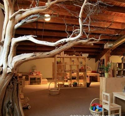
Classroom Design: Does Yours Engage Or Distract?
Elementary School Classrooms are a sight to behold! So much learning takes place in these dynamic spaces! Although on a recent visit to my little kinder's classroom, so busy and alive with STUFF, I wondered--- Is the design engaging her to learn, with all the displayed work, colors and pin boards, or is the design just distracting her?
Edutopia author, Randall Fielding offered the following interesting insight to have good outcomes for both design and lighting within classrooms.
Most architects and designers (though unfortunately not all) have long known that in schools, access to natural light improves learning and test scores, while poor electric lighting distracts students and can cause inattention, even leading to a kind of creeping depression. A good reason to make classroom design a priority.
Though many school buildings have naturally lit classrooms, their interior rooms and work spaces rarely see daylight. Space in many classrooms is a commodity and windows sometimes get covered in the clutter or even worse, teachers, in an attempt to "keep the attention of students" keep blinds closed, sabotaging the very goal at hand! In this and so many other ways, school buildings organized around plans developed in the industrial era for efficient management of work, today resemble prisons, where the central design mandate is to manage the largest number of inmates with the smallest number of guards. If we don't want our schools to function like prisons,
we need to understand the difference between design that punishes and design that nurtures.
The Design Basics Worth An Educator's Attention
Light and color in classroom design play key roles in the success of students. It is important to have an understanding of the following design elements for a classroom, when impactful learning is the goal.
Heavily decorated rooms warrant off-task behavior to last 10% longer according to Carnegie Mellon's Anna Fisher, Karrie Godwin, and Howard Seltman. By keeping the design of a classroom clean and clutter free students are more able to concentrate on the task at hand rather than the goal of last week's project. Keeping an elementary school classroom neat is quite a challenge, especially if the space is small. The best way to accomplish neatness is to have supplies, tools, furniture, and books stored instead of left out.
Lighting: Uniform illumination is a concept that is past its time. A better approach includes brighter illumination near the center of the room than in adjacent bays or niches. Stronger, directed lighting on display or teaching walls provides a visually dynamic learning environment.
Windows: For many students, spaces without visual connections to the outside create a closed-in feeling and increase anxiety. Kids in such schools focus less on learning and more on escape. Please don't close the blinds.
Color & Texture: Children are wonderfully sensitive and responsive to nuances in lighting, color & texture. They are particularly attuned to the colors & textures of nature and human skin tones, and yet these hues are completely out of the primary range; the colors so often used to decorate their classrooms and other spaces. Primary colors can be harsh, and are best used sparingly in classrooms. Research shows that learning benefits from a carefully applied stimulus-rich environment, that has a balanced color palette. Not from a palette dominated by gray, beige, white, or off-white or one that over stimulates with primary colors.
And so, just the same as most everything else in life, CLASSROOM design is best when in balance.
